trek review


july.03 05
 
Hi David,
 
I just wanted to thank you for your work and inspiring me. Your the reason I wanted to do graphic design (you must hear that a lot). I first saw your work for Ray Gun at the Borders in my hometown in Illinois. I didn’t even know what what you did was called, but I knew at that moment that’s what I wanted to do. That was about eight, nine years ago… I went to art school and worked at a few design agencies, and now at an in-house design department for a fairly large company near Portland, OR. I came to a transitioning point these past two days, and decided I should go back and take a look at what inspired me in the first place. I went to the Borders here and checked out your book, Trek. It re-inspired me… and when I saw the page with the spread (with a cropped photo of a red flower) and the next page with the little stars scattered across the page, it went straight to my heart, and I knew what I wanted to do. Your work inspired me nine years ago, and did it’s work again just today. I plan on finding more creative work now. Thanks for that. What you said, “Trust your gut. Do what you love…” really stuck with me as well. I believe it. I put it on one my stickies on my laptop. Anyway, just wanted to say Thanks for all YOU do… and inspiring and motivating all those who appreciate your work… and to let you know you are making a positive difference in people’s lives.
 
Tommy
 
 
april.30 05
 
hello david,
my name is daniel orme and i live in south africa. I am in my second year of graphic design and am at a constant srugle with all the closed minded lectures who live inside there boxes. I came across a copy of “end of print”first edition, in our campus libary in the first week of my first year, it was hiding at the back, just that one copy. At first it was the cover that appeald to me, the spine barly cracked I started paging through the first few pages. It was like every page was gold and i tryed to handle the leaves as little as i could so i didnt damage them… I couldnt discribe the feeling i was feeling, I sorta colapsed down to the floor and cradled the book in my folded legs and continued to page. My girlfriend,Mel, work for a sub culture surf/skate/music magazine called Blunt and the publisher sadly hates your work along with the conservative designer, but the editor had a copy of the End of print(updated) so I am borrowing it, iv had it for about a month now and i cant stop looking through it, I literely read it every single day. I am saving up to buy “Trek” and my own copy of “end of print” But its hard to save when you spending money on printing every week. We have the “Design indaba” In Cape Town and i saved up just enough money to go last year but the week befor i was forced to spend it all on printing. And our economy doesnt help either. Please forgive me but I even contenplated tryna steel “end of print” from our libary. Dont worry I will buy it… eventually.
Iv got my British citizinship so as soon as im done studying im goin over to live and work for a while…maby I could meet your friend Ed. I was also thinking about the U.S, then i could meet you…That would be the highlight of my life, If i die after meeting you then I die a happy man…ha!
Oh well,I really hope you get this and I hope even more that you arnt to busy to say hi. Thank you soooooooooooooo much doing what you do,
you are more than an insperation for me.
 
Till we meet,
daniel
 
 
mar.23 05
 
Sent: Mar 23, 2005 10:49 AM
To: dcarson@earthlink.net
Subject: way2go
 
way2go! as the first time I saw david carson’s design, it seemed the world has turned upside-down. postmodernism has colored the world of grafik design. david carson is iconed as an icon of postmodernism design (according to No More Rules in Postmodernism Graphic Design). and recently I have been studying of what postmodernism is. mr carson, i still don’t understand its concept–beats me. i wonder if you would drop by to indonesia
 
 
feb.25 05
 
Sent: Feb 25, 2005 3:51 PM
To: dcarson@earthlink.net
Subject: thanks for the inspiration
 
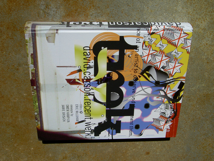
I just picked up your book TREK at my local book store.
I almost cried.
I have decided that i am going to rock the art world.
See you in a few years.
-Rob Mach
 
 
dec.14 04
 
Dear David Carson
 
I have just graduated from college as a typographer, and wanted to let you know that in the whole boringly derivative world of contemporary graphic design, yours is the only work that is genuinely original, refreshing, and makes visual and intellectual sense. I love it. Thank you for providing so much inspiration.
All the best
 
Shaun
london
Dec, 14.04
 
 
nov.30 04
 
Hi, i hope this email gets to Mr. Carson somehow. I am a student at The Art Institute of Portland OR, well im going to be graduating the 17th of December. i just wanted to tell you how much i enjoy your books, the only thing that really keeps me moving along is seeing how much different and creative someone is besides what the system wants designers to be. My graduating class is having a portfolio show and everyones book looks pretty much the same, all but mine. in a way i am kinda scared because my stuff is so much different, but in a way i know its better that my work doesnt look like everyone else’s. Thank you, through your books for having a direct influence on what i do and how i look at design, unlikely i would even be this far if it wasnt for them. i am enjoying your new book, keep up the good work.
-Carlos
 
 
Jul.23 04
 
“No one can get me to sit down and thumb through a 450+ page scrapbook except the grandmaster of Graphic Design himself, David Carson. Page after page DC’s Trek creates a sense of newborn wonder”
Jason Brooks – BPM magazine issue 55
 
 
june.14 04
 
david
Just saw you’re new book ( TREK )! Man, soooooooo nice… again!
 
You’re the best! Live long!
Good Day…
;) mike
 
 
june.14 04
 
Hey David, it’s Kent . I met you when you were speaking at the Art Institute of Pittsburgh, in 2002. I’m absolutely estatic about the release of Trek! Your beautiful work in a deconstructive manner shows that the world, and all in it isn’t perfect. Yet somehow when I view your art it seems to make a bit more sense. So glad to see the overwhelming amount of new stuff to look at and perhaps print has not yet reached its
 
 
june.10 04
 
hello mr. carson. you may be wondering a bit about my email address (the whole @us.army.mil thing). well, i am in the army, and am an aspiring graphic designer. you might think the two contradict each other, and perhaps they do, but it is all a part of my trek (seriously, no pun intended!). my eyes were opened to this amazing field of vision and imagination when i attended the california state summer school for the arts, csssa, at cal arts in valencia, ca. i had origionally signed up to major in painting during the month-long session, but realized that it probably was not the best of choices for me. at teh time i was unsure of what i wanted to do with my creativity even though i knew then that i wanted to be an artist. i attempted to get into an animation class but could not based on registration and portpholio requirements, so teh next best choice for me was digital media arts. i will admit i was a tad reluctant at first, but oh, how i fell in love the first day. that one month i spent glued to the computer as if it were my life line.
it was truely a liberasting experience. it was only after i left csssa that i realized i was interested in graphic design all along when i returned to my room at home a saw all the magazine spreads tacked to my walls, teh stacks of cd jewel cases, and teh misc postcards, promos, etc. after csssa, however, i had a lack of inpiration, until i found one of your books. my first book on graphic design htat i bought was 2nd sight. i saw both theendofprint and 2ndsight, but for whatever reason i chose the later. reading about how your art was fed by your intuition really sent me into a designing frenzy since then. i currently own (and have read) theendofprint, 2ndsight, fotografiks, and trek.
it is very dificult trying ot express myself as an artist while serving in the military, but i am managing. my sketchbooks are becoming large bodies of works in themselves. i can’t seem to stop drawing, printing and thinking about design. i suppose that what i am trying ot say amongst all of this blah, blah, blah and stuff is thank you. thank you for inderectly providing me with teh artistic direction, guidance, and inspiration that i have been craving. i most anxiously look forward to getting out of the military after my tour and attneding school for design before, after, of while my wife attends for fine art. it is in my blood, my heart and my soul. it is one of my many ways of life. it is how i choose to view the world. again, much thanks for making me think. if you have the chance please write back, if not, that’s cool too. take care.
andrew
 
 
june.5 04
 
Mr Carson,
 
I was recently given trek as a gift for being a great mother and an incidental grafiste. Thank you!
I LOVE it!
I saw you a few years back in Sydney, Australia, and you inspired me then; with trek I can dream, learn and enjoy the seemingly limitless possibilities of design in the comfort of my own home…
This email sounds really pretty corny, but I really wanted to let you know how much of an inspiration your work is.
Okay, over and out for now,
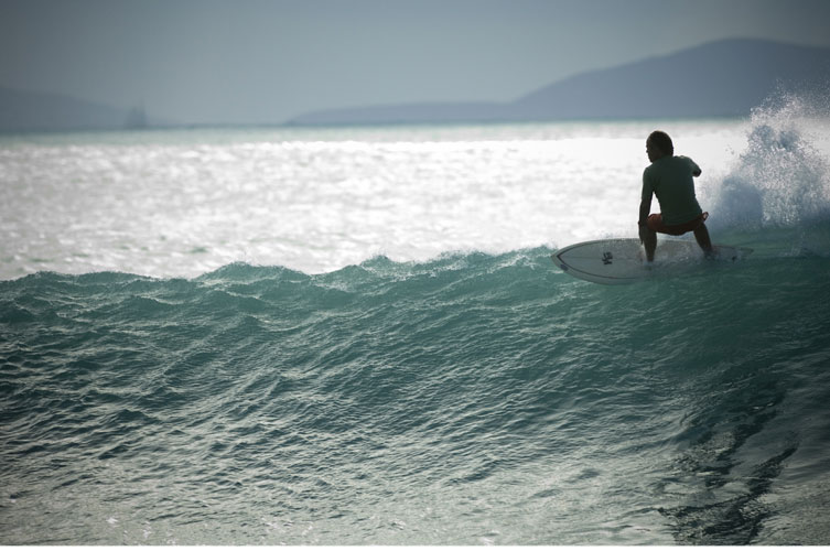
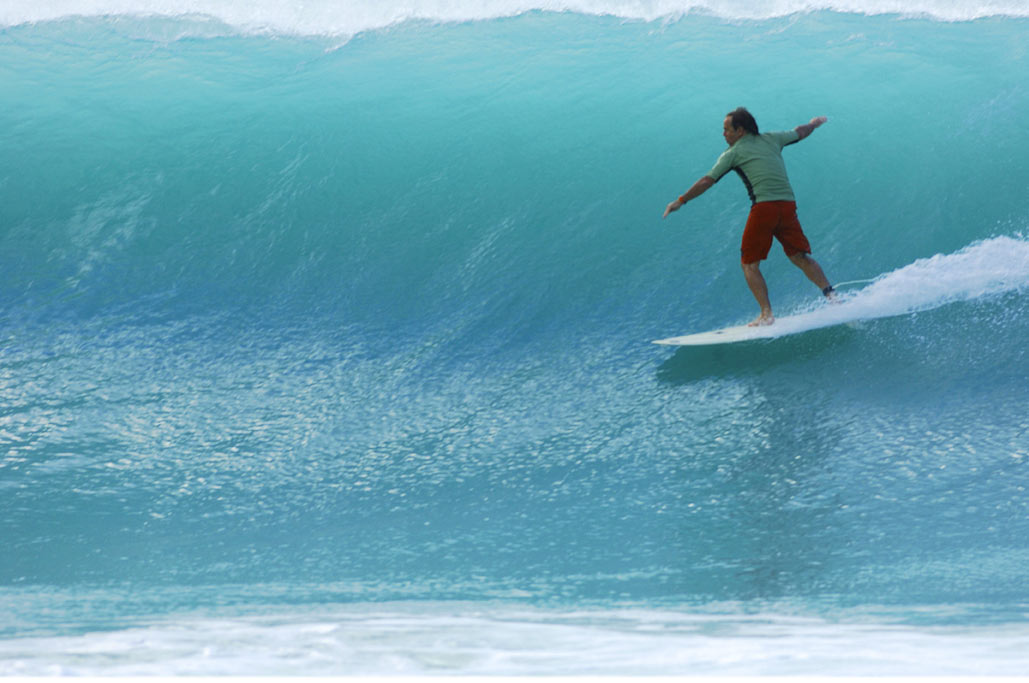
Be good and enjoy the surf.
 
caro (Australia)
 
 
feb.24 04
 
hi david i toke the book today(!) from my country (gr)
i was ready to buy it from amazon… but the book came here at the right time!
 
anyway… this book… how can i say… bring me back to a new inspiration..
to change the thinks in my work.. in my life… to change the way to do the most thinks…
to put some ideas in right way… the right claim for this book is ‘free your mind’ !
 
thanks for all,
Kostis
 
 
feb.12 04
 
jack babiloni
David Carson made history in magazines and many people can’t stand envy, especially bad (conventional) designers.
 
DC was and IS the king of typographers and I thank him because he made bad writers to look masters and when I see his work I feel alive, tense and emotionally touched.
 
Nothing in world graphic design (except my work and Jennifer Sterling’s) seems to be as alive as his.
 
Thank you for reinvent the beauty, Mr Carson!

feb.5 04
 
Mr. Carson,
Judging from the number of letters and e-mails I saw printed in your latest book, I assume you get quite a few letters like this. Regardless, I still wanted to write you to tell you what an inspiration your work has been. When it was first hinted at that you would be doing the graphic design for Nine Inch Nails’ album The Fragile, I looked you up online and ended up purchasing your book as soon as humanly possible. I loved what I saw then, and I continue to love your work. It’s easy to forget that our world is simply made up of intricate shapes and colors, and your work emphasizes the simplicity AND the intricacy of this concept. It makes you think, and thrills the senses all at once. Thank you for the work you do, and here’s to many more years of Fotographics!

Chris Brightly
 
 
feb.5 04
 
David, or whoever will read this. You are the inspiration ITEM for my work. I am a graphic designer, and your work was the subject of my Masters degree. 3 years are past since I finished my studies, and I still remember almost every word of your books, article, etc. Thank you for changing my visual point of view.
 
Yiannis Hadjipanayis
GraFik Designer – VISual Communicator
 
 
the first Email/review of trek.
 
“Grande Carson! this is the book we were waiting for!
it deserves a special place in our studio’s library
 
thanx
 
alex
art force thesign
italia”
 
 
hi david_
just dropped by @ artazart_paris for a copy of trek.
love it
dreamed through some of the speads last night (!!!)
which means that it goes way down deep. bravo.
 
 
TREK is great, its the best ive ever seen as a design-book. and, it is art, art because you made it to a personal book. i feel more respect then ever for you, because you brought your live to a closer look. beginning with lots of pics about the surf and about your son and daughter,they are really sweet, because of the arriving of the kitchen to tortola… the small things that matters. sorry, my english is to bad to put it in right words what your life-work means to me…
 
and i also see in the book some sadness, some hard times you must have been going through…and it reflects some pages, for me…but its art so its just my interpretation…
 
i truly love the book, respect you more then ever… and hope to meet you one day for at least a cup of coffee.
 
sven


The first Probes review on Amazon.


The first Probes review on Amazon.
5 stars on amazon
 
“a beautiful, insightful book for the post-literate era, December 5, 2003
High praise to Gingko Press for such a beautiful book in both construction
and graphics, a retrieval and development on the original Quentin Fiore
collaborations of the sixties. And this is no ordinary book of quotations,
organized by topic or chronology. Each quote indeed acts as a probe for the
reader, and of the reader; and collectively each of the hundreds of isolated
insights echo and haunt the others. The effect is similar to the famous
Monday night seminars; close the book and you are not quite sure what you’ve
learned, but walk around and the way you see the culture has been changed.
For the literati, there is an introduction and an important essay by W. T.
Gordon describing McLuhan’s debt to de Saussure’s linquistics. But this is
not a book for the scholars and their after-the-crime-has-been-committed
analysis. This is a book for the streets, not the ivory tower, for the poets
and novelists, the misfits and malcontents of the digital consensus. It’s a
good review for those familar with McLuhan, and should be a fine
introduction to a new generation of independent media scholars.


SURF CULTURE: Review ‘ESM’


SURF CULTURE: THE ART HISTORY OF SURFING

 
Review By Mike Fish, ‘ESM’
 
In last issue’s Surf Art feature (Vol. 12, #88), ESM posed the following question: Surfing-art or sport? A related riddle would be: Ls there a difference between the surfer who makes art and the artist who surfs? The answers to these ambiguous musings certainly don’t come easy, but the newly released print masterpiece Surf Culture: The Art History of Surfing dips deep below the surface to explore the relationship between the two different- yet ultimately related-forms of expression.
 
This book is truly one of a kind-but in many different ways. Realistically, you could write three separate reviews for Surf Culture, from the standpoints of literary topic, photography, and layout. Encased in a top-quality binding, it’s a vast historical reference; a photographical tour-de-force; and a portable art gallery in your hands. Pour all that into multimedia award winner David Carson’s legendary design blender, and you’re sipping one hell of a verbal and visual cocktail-and a potent one at that. It’s a lot to digest for even the most sophisticated palate. But take your time and imbibe slowly, because if you savor each sentence, piece of imagery, and mind-blowing layout-you’ll definitely close the pages satisfied… and even a little buzzed.
 
From the 200-pound balsa planks and romantic curl searches of the early 1900s to the present day’s flyweight tri-fins and internet surf forecasting, the book takes an inventive look at the themes that coalesce surfing, art, and pop heritage. Surf Culture works to define the sport’s progression (spiritually, physically, and industrially), and its uncanny impact in the realm of art, while dispelling some of the nebulous myths accompanying its rise to popularity. “Kids in Kansas bolted surfboards to the tops of their cars in homage to the imagined surf lifestyle,” Craig Stecyk-longtime surf/ skate scene observer and co-author of the screenplay to the film Dogtown and Z-Boys-writes in the introduction. “The marketing frenzy, led by non- surf types, redefined the parameters of popular culture.”
 
For the surf veterans in our tribe, the opus provides a nostalgic ride down the sacred memory line, while the rising grommet or newcomer practically finds a unique education full of glimmering treasures and unmatched heritage. Hundreds of illustrative color photos, art in every conceivable form, arresting pull-quotes, and six kinetic essays weave the plotline. The narrative runs similar to a series of short, creative historical tales that connect-kind of like a film by Quentin Tarantino or Oliver Stone. Carson’s signature, beyond-the cutting-edge design flows like a collage, making you feel like you’re flipping through a salient scrapbook or intricate mixed-media surf diary. And although the layout can be a little overwhelming at points in relation to the text, because of its extremely abstract nature, on the whole it compliments the flow. The writing is topnotch, showing a noticeable diversity in style and content from all contributors including Stecyk, Bolton Colburn, Ben Finney, Tyler Stallings, Deanne Stillman, and Tom Wolfe.
 
The in-depth, 279-page endeavor was published as part of an art exhibit organized by the Laguna Art Museum in Laguna Beach, CA, and The Contemporary Museum Honolulu, HI. The show has already received a steady swell of international acclaim from dozens of journals and newspapers, and the Contemporary Art Center of Virginia recently brought the exhibit to its only Right Coast venue. “Surf Culture is not a comprehensive survey of the history of surfing, or even art related to surfing,” writes California surf legend Bolton Colburn, director of the Laguna Art Museum. “There is no way it could be. In the process of preparing the exhibit, we soon realized that we could not address every question or pursue every angle. Surfing and its effects on contemporary culture is too large a subject for one exhibition, or one museum to tackle.” But the writers, editors, and designers did a damn good job of encapsulating a subject that resists being so easily pigeonholed. Because of this, Surf Culture isn’t merely an art book. Instead it’s a fundamental resource on the history and meaning of our endless pursuit, playing an integral role in the past, present, and future of surfing.
 
So is there a line in the sand between the surfer who makes art and the artist who surfs? Possibly, but the themes in Surf Culture could argue that the liquid bond between the two almost makes them one in the same-similar to the rider and the wave.
 
This book was published by the Laguna Art Museum in association with Gingko Press, Inc. and costs $39.95 for paperback and $49.95 for hardcover. For an extended online preview, visit
www.lagunaartmuseum.org and to order, visit www.gingkopress.com or e-mail books@gingkopress.com


branding

 
archive: review-branding:


From my hotel room in Frankfurt.

 
Right side remainds me of Rothko a bit (1999). Digital print from 35mm photograph on archival paper by David Carson
 
Branding Carson.What do you do next when you’re one of the world’s most famous graphic designers? Teal Triggs looks at David Carson’s transformation from designer to digital artist.
 
from”Graphics International” Issue 88, 2001
 
The name of David Carson became synonymous with what was considered to be cutting-edge graphic design in the early1990s. His unmistakable ‘experimental’ editorial design work for lifestyle and music magazines such as Surfer, Transworld Skateboarding, Beach Culture, Blue and Ray Gun gained him worldwide acclaim, as did his television commercials for global corporations such as Nike, Pepsi and Microsoft. At the pinnacle of his popularity, Carson’s trademarks became a cold bottle of beer, a long queue of adoring fans (male and female) and a felt-tip marker, which heused for autographing anything from T-shirts to books. This was the graphic-designer-as-rock-star, living an itinerant life of wall-to-wall airport lounges, luxury hotel rooms and limousines-before Carson, only British designer Neville Brody had come close to occupying such a rarefied position. When Brody met Carson in 1994 for Creative Review’s now famous Face to Face interview and remarked that for him, Carson’s work represented the ‘end of print’, the challenge was set. As the 1990s played out, Carson took ‘the end of print’ as his mantra, using it as the title for one of the most successful design books of all time and, in its wake, becoming the focus of numerous heated typo/graphic debates. But what else could be expected from someone whose work teeters precariously between the usually well-defined bound-aries of art and graphic design?
 
Some six years after The End of Print was first published, David Carson is still managing to maintain his controversial position.While he is no stranger to exhibiting in museums abroad, appearing as part of a group show held in a commercially led fine-art gallery is somewhat different. The venue is the Marlborough Fine Art Gallery, located in one of London’s more expensive shopping districts. The show is titled “CD:1,Contemporary Dialogue: 1″, and features the work of six recent fine-art graduates from the RCA and Goldsmith’s. These are painters and sculptors who, the gallery proclaims, “eschew the current trend towards video and installation.” Equally, the gallery sees David Carson’s inclusion in this show as breaking from the norm, as he is neither British norart-college trained. However, he does represent the gallery’s continued interest in promoting graphic art-a tradition that began in the 1950s. At the same time, despite being a household name in graphic design, David Carson is virtually unknown withhim the contemporary British art world.
 
Nicola Togneri, who represents Marlborough Fine Art, comments that showing the work of graphic designers in an art gallery has recently become much more acceptable. She explains: “The subject matter of much of David’s work appeals to a younger audience. He is really very much about the ‘now’” Although he still commands a tremendous amount of respect from his fellow designers, it is debatable whether Carson’s work would be considered by them to be anything remotely resembling ‘cutting-edge’. By including him among these up-and-coming British artists, the gallery hopes to introduce Carson to a new audience of art aficionados. In so doing, it hopes to prompt some sort of dialogue about exactly what is happening “now”-be it in the discipline of fine art or graphic design.
 
In either case, the work on show suggests that Carson is far from rejecting the roots of his early experimental design work. Here, in a series of letter press prints, overprited posters, press proofs and photographic prints, Carson’s interest in the process of making and collecting are still very much in evidence. Visually, this work is not so very different from the early image-making he did for Ray Gun-the collages constructed out of elements of found paper, printed graphic ephemera or blurred photographs that highlight the graphic minutiae of the street. Immaculee Conception (2001), for example, is both a found poster as well as an experimental surface for Carson’s overprinting of red-inked typographic forms. One of the more interesting pieces in the show, the screenprint plays upon what might be read as a provocative juxtaposition of David Carson’s name with an engraving of a French mid-19th century Madonna, enshrined by plump cherubs.
 
The majority of the work on show is not really new, either in terms or its content or direction. For example, some of the photographs have already been published in Carson’s book Fotografiks, including From my Hotel, Frankfult. Right Side reminds me of Rothko, a bit. (1999), Lights (1999) and New York Subway. On the Way to Coney Island (1999). The subject of the letterpress work is also familiar. Forming a sort of typographic variation on a theme, David Carson’s name appears repeatedly as a visual element on psters advertising workshops such as those held at the Ecole Cantonaled’Art de Lausanne, Switzerland. Likewise, the recycling of letterforms continues in his more recent experimental letterpress work. Carson suggests that this was a matter of convenience: “The type just happened to be around.” Although the text was familiar, the design process involved in these overprinted pieces on found paper was not. Carson explains: “I spent time in Barcelona doing lithographic work on these big stone pieces, where you literally got up there, put the paint on and did the whole thing. I’ve come late to this process, but I found it fascinating. I wouldn’t say this is the new work. The new work is the old work, in a sense. It’s discovering a new technique, and it’s moving into fine art.”
 
What is missing, in this ‘new’ old work, however, is the crucial context of the printed page. While a well-established commercial gallery space does offer a new place for it to be viewed, Carson’s narrative structure is subsequently reduced to a selection of single, framed, limited-edition images. Now they appear as isolated moments that say more about Carson and his process of working (and his travels) than they do about the substance of his experience. This may be no bad thing, especially as the formality of the images’ composition and their colour still resonate. But is this enough to warrant placing them on a gallery wall? What has always been successful about Carson’s work as a graphic designer is his ability to integrate image and text in an interesting, if not questionable, fashion. Philip Meggs writes in Fotografiks: “Designers see the page, not the photograph, as the locus of their creative enterprise David Carson formed attitudes about this visual/verbal interface and its potential for expression.” In many ways, for Carson to remove the photograph from its basic context further problematises the work.
 
Which brings us back to the designer as artist, or in this case the artist as designer. Intuition still forms the basis for much of Carson’s image-making. Upon reflection, Carson notes: “The early magazine work was very subjective, reacting to something I had just read, music I listened to, or people I met. Now I am just interpreting that and hopefully reinforcing it’s Ideally, someone would buy my work because it ‘spoke’ to them in some way.” However, Carson is quick to point out that unlike graphic designers, fine artists are not continually asked to justify their work: “People complain that ‘there is no real concept’ or say that ‘it just falls together’. In certain places maybe that is okay, but I think this is where fine artists can pull it off.”
 
In keeping with the conventions of fine-art practice, every print and photograph in the gallery is signed. And, in combination with the repeated use of his name in the works themselves, there is little doubt that this is a branding exercise. Togneri admits: “We are working with a brand identity here. It is high quality, but it is a new brand.” Well, for the art world, maybe. In the age of Naomi Klein’s No Logo, and an ever-increasing publicscepticism towards brands, Carson is a risky prospect. He knows he hasn’t made it quite yet as an ‘artist’ and is finding the lack of feedback disturbing. This was evident on the night of the Gallery’s private view, where Carson remarked: “It is strange to be so anonymous.”
 
So it is no surprise, then, when Carson eventually returns to the subject of his commercial work. His latest project is The Book of Probes, which is a collection of aphorisms and excerpts from of aphorisms and excerpts from Marshall Mcluhan’s own illustrious, albeit controversial career. Carson is the art director and designer on the project and shares a cover credit. He describes the opening sequence: “The book starts out with a big long section of nothing but photographs I’ve taken of cactuses in the desert.” Is this ‘the book as art gallery’?
 
Carson is clearly a Mcluhan fan and is keen to promote this 672-page achievement, which skilfully combines his love of the photographic image and penchant for typographic experimentation. Carson points out that Probes is about introducing McLuhan to a whole new generation of readers in an accessible way. “The book will give some intriguing quotes that look interesting visually For fans who have had some difficulty in reading McLuhan from cover to cover, we’ve created a primer, a teaser of some different thoughts.” The sources of the quotations are listed at the back for those who want to find out more. The book is classic Carson: the dialogue moves seamlessly between designer, author and reader.
 
Exactly what the Marlborough Fine Art Gallery intends the ‘contemporary dialogue’ with Carson to be, is up for grabs. Those who read the design press won’t easily forget the David Carson who has been at the centre of numerous graphic authorship debates. Is Carson attempting to legitimise his seemingly art-based design practice by moving into a gallery context? Or is this merely the next logical step in his brilliant career?
He has already been part of a group of radical designers who unwittingly began to define a visual landscape for the consumer-based youth culture in the 1990s. Is he trying to do the same in the art world of the 21st century?


Spreads from The Book of Probes


first things first

 
archive: review-first things first: first things first:
 
the men in the mirror, recent thoughts on some old ideas
by david carson, usa
 
note: this piece was orginally submitted as requested to adbusters magazine.they refused to publish it saying:
 
“The point of the manifesto was not to hold up 33 shining examples to the design world, but to stimulate much-needed debate,……”
go figure-dc
 
” First Things First” is a reasonable, common sense approach to looking at the work graphic designers do. it offers some good advice for young designers: Don’t sell your soul to the devil; listen to your conscience; Find ways to help make the world a better place. Don’t waste your talents helping sell people things they don’t need. And while the original document rallied against the evils of doing design for “toothpaste” and “after shave lotion”, I would today add such categories as racism, domestic violence, cigarette smoking, and guns as worthy examples of areas to avoid promoting.
 
Any document signed by Irma Boom is worthy of serious consideration. She embodies the heart and soul of the MANIFESTO. Some of the other signers are more suspect. And there are a surprising number of non-designers who have attached themselves to the ‘new’ document. with so many of the signees having made their living thru various forms of advertising, the overriding message of the new MANIFESTO seems to be one of hypocrisy.
 
Interestingly the list of defectors continues to grow. one prominent head of a design school recently told me she “wished i had never signed that thing”, and said had she read it more carefully, she would not have signed. I was told the same thing from an educator/lecturer in england just this month.
 
Th new MANIFESTO was spearheaded by a designer who reportedly made millions of dollars “doing advertising”. the list also includes a designer of a glossy women’s fashion magazine, as well as a museum curator whose colleagues told me was able to build himself a new house from “all the money he made from advertising”.
 
Rudy Vanderlans comes closer than most to actually living and representing the ideas expressed in the Second First Things First. He’s also one of the few designers who excels both at writing AND designing. The value to the world, however, in selling typefaces and sending unsolicited graphic design magazines thru the mail, is unclear.
 
freelance writer Rick Poyner was brought in to help “redraft the original” manifesto. Poyner has been described as a “design connoisseur” by fellow British writer william owens, as well as “the ultimate design groupie” by Neville Brody. Either way, Poyner is a clever and skilled writer, and as good a choice as any to help to rewrite any original document. It is troubling that Poyner uses his considerable writing talents only to address a multitude of ‘graphic design’ issues, including letting us know about typography now, and interviewing famous graphic designers. Why not take the message of the original MANIFESTO to heart and write about “the things that really matter”. perhaps addressing some of England’s numerous social problems could be a good place to start. Poyner continues to point out how much press his ftf gets, while seemingly generating the majority of it himself.
 
Historian Steven Heller, though not as talented a writer as Poyner, is nonetheless the most prolific. Heller chooses to write books about “Newsletters Now”, and “What the Best Dressed Books and Magazine Covers are Wearing”. The original MANIFESTO rallies against work that “contributes little or nothing to our national prosperity”. With Heller’s love of the written word, and his many connections in the publishing field, perhaps more important topics could be addressed in future books. hellar did attempt this with his recent ‘swasticka’ book, but it was critically panned. the highly respected british magazine things, in a lengthy review said “Heller is part of a group trying selectively to retain one view of how the worlds morals should shape up…”
 
If writers are going to call on designers to aspire to loftier goals, is it too much to ask the same of writers? Design solves design problems, and if it must be judged, should be judged accordingly. There are organizations, institutes, clubs, etc., already set up to deal with a multitude of important social, economic and political issues. True change comes from the bottom up. Sometimes designers can help. Sometimes not. But the idea of an elite, select few, chosen under questionable guidelines, telling the ‘masses’ what they ‘should’ be doing, never rings true or instigates fundamental change.
 
Students or professionals considering the MANIFESTO would be well advised to look closely at the people who signed up for the second go ’round. Spend some time with Max Brusima. Really listen to Erik Speakerman. Sit through a two hour advertising portfolio presentation by Jonathan Barnbrook (like the one he recently gave in Bremen, Germany). if these folks, or any of the others, represent what graphic design is to YOU, then, by all means, jump on board.
 
A majority of the original signers of the First Things First, have had little or no lasting impact on graphic design. Or in making the world a better place. Surprisingly few of the names from the 1964 list are recognizable to design professionals, students or professors today. And while the list contains some outstanding individuals, with few exceptions, they were not people who made a difference. Sometimes history has a funny way of repeating itself.