archive: review-branding:
From my hotel room in Frankfurt.
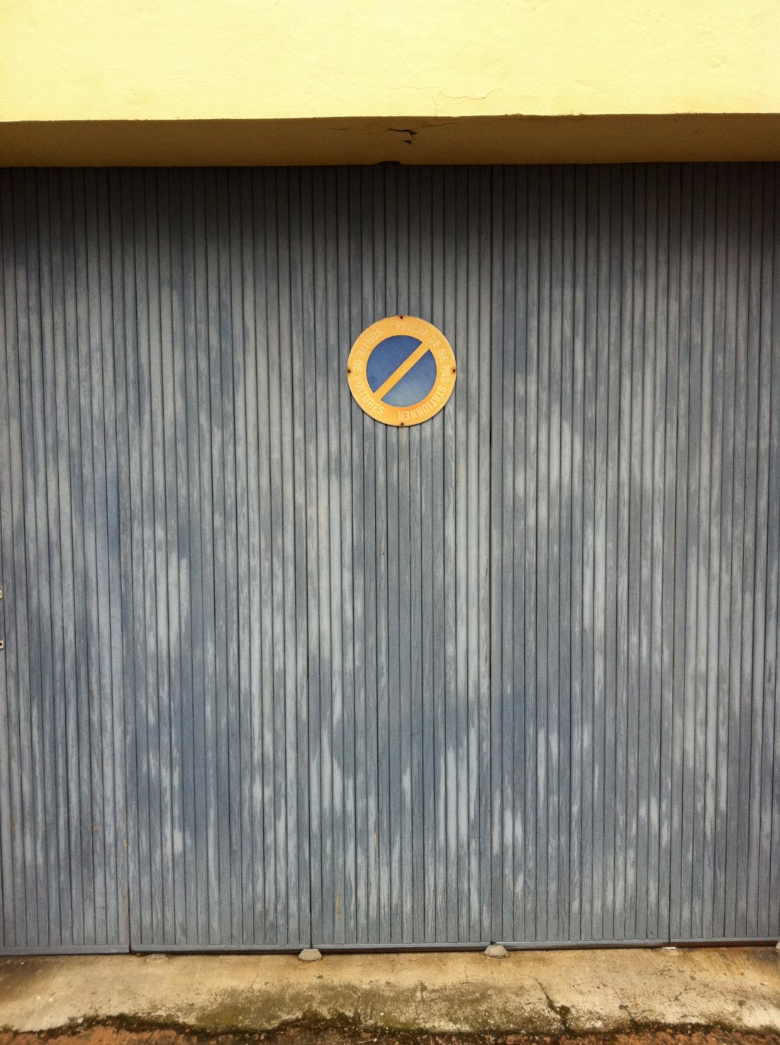
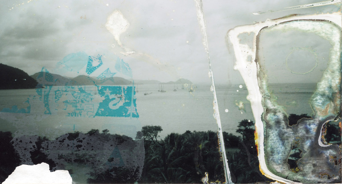
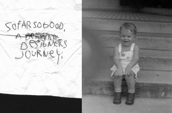
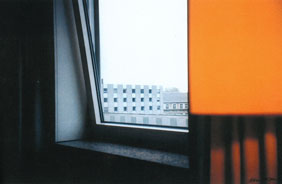
Right side remainds me of Rothko a bit (1999). Digital print from 35mm photograph on archival paper by David Carson
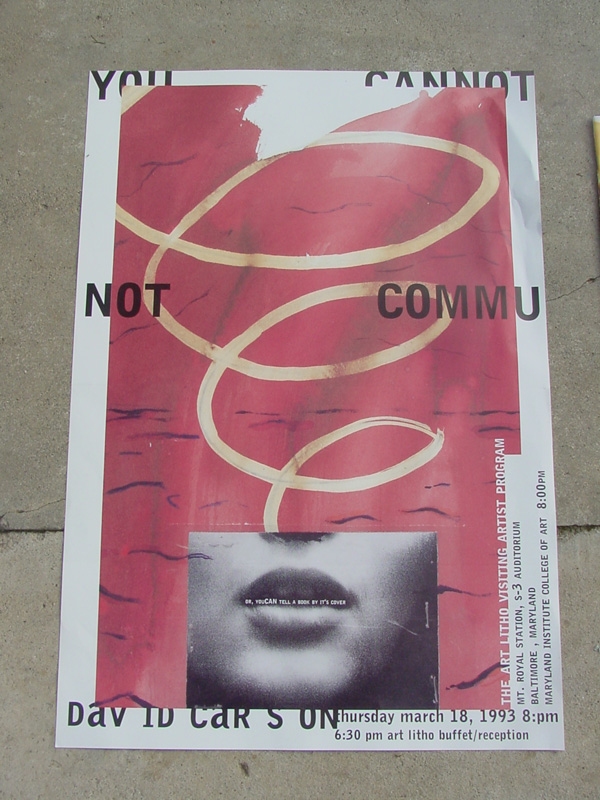
Branding Carson.What do you do next when you’re one of the world’s most famous graphic designers? Teal Triggs looks at David Carson’s transformation from designer to digital artist.
from”Graphics International” Issue 88, 2001
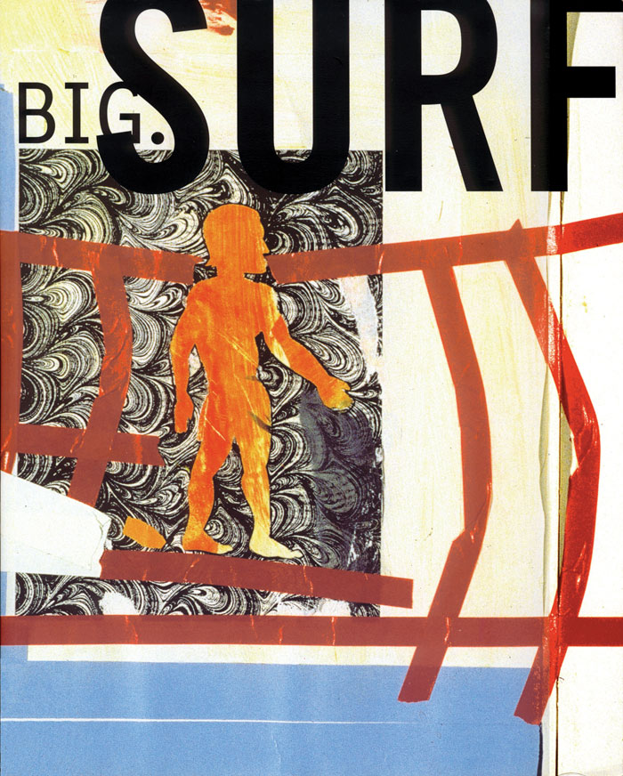
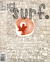
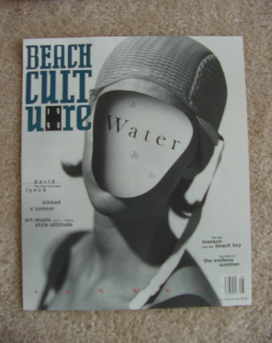
The name of David Carson became synonymous with what was considered to be cutting-edge graphic design in the early1990s. His unmistakable ‘experimental’ editorial design work for lifestyle and music magazines such as Surfer, Transworld Skateboarding, Beach Culture, Blue and Ray Gun gained him worldwide acclaim, as did his television commercials for global corporations such as Nike, Pepsi and Microsoft. At the pinnacle of his popularity, Carson’s trademarks became a cold bottle of beer, a long queue of adoring fans (male and female) and a felt-tip marker, which heused for autographing anything from T-shirts to books. This was the graphic-designer-as-rock-star, living an itinerant life of wall-to-wall airport lounges, luxury hotel rooms and limousines-before Carson, only British designer Neville Brody had come close to occupying such a rarefied position. When Brody met Carson in 1994 for Creative Review’s now famous Face to Face interview and remarked that for him, Carson’s work represented the ‘end of print’, the challenge was set. As the 1990s played out, Carson took ‘the end of print’ as his mantra, using it as the title for one of the most successful design books of all time and, in its wake, becoming the focus of numerous heated typo/graphic debates. But what else could be expected from someone whose work teeters precariously between the usually well-defined bound-aries of art and graphic design?
Some six years after The End of Print was first published, David Carson is still managing to maintain his controversial position.While he is no stranger to exhibiting in museums abroad, appearing as part of a group show held in a commercially led fine-art gallery is somewhat different. The venue is the Marlborough Fine Art Gallery, located in one of London’s more expensive shopping districts. The show is titled “CD:1,Contemporary Dialogue: 1″, and features the work of six recent fine-art graduates from the RCA and Goldsmith’s. These are painters and sculptors who, the gallery proclaims, “eschew the current trend towards video and installation.” Equally, the gallery sees David Carson’s inclusion in this show as breaking from the norm, as he is neither British norart-college trained. However, he does represent the gallery’s continued interest in promoting graphic art-a tradition that began in the 1950s. At the same time, despite being a household name in graphic design, David Carson is virtually unknown withhim the contemporary British art world.
Nicola Togneri, who represents Marlborough Fine Art, comments that showing the work of graphic designers in an art gallery has recently become much more acceptable. She explains: “The subject matter of much of David’s work appeals to a younger audience. He is really very much about the ‘now’” Although he still commands a tremendous amount of respect from his fellow designers, it is debatable whether Carson’s work would be considered by them to be anything remotely resembling ‘cutting-edge’. By including him among these up-and-coming British artists, the gallery hopes to introduce Carson to a new audience of art aficionados. In so doing, it hopes to prompt some sort of dialogue about exactly what is happening “now”-be it in the discipline of fine art or graphic design.
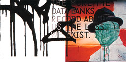
In either case, the work on show suggests that Carson is far from rejecting the roots of his early experimental design work. Here, in a series of letter press prints, overprited posters, press proofs and photographic prints, Carson’s interest in the process of making and collecting are still very much in evidence. Visually, this work is not so very different from the early image-making he did for Ray Gun-the collages constructed out of elements of found paper, printed graphic ephemera or blurred photographs that highlight the graphic minutiae of the street. Immaculee Conception (2001), for example, is both a found poster as well as an experimental surface for Carson’s overprinting of red-inked typographic forms. One of the more interesting pieces in the show, the screenprint plays upon what might be read as a provocative juxtaposition of David Carson’s name with an engraving of a French mid-19th century Madonna, enshrined by plump cherubs.
The majority of the work on show is not really new, either in terms or its content or direction. For example, some of the photographs have already been published in Carson’s book Fotografiks, including From my Hotel, Frankfult. Right Side reminds me of Rothko, a bit. (1999), Lights (1999) and New York Subway. On the Way to Coney Island (1999). The subject of the letterpress work is also familiar. Forming a sort of typographic variation on a theme, David Carson’s name appears repeatedly as a visual element on psters advertising workshops such as those held at the Ecole Cantonaled’Art de Lausanne, Switzerland. Likewise, the recycling of letterforms continues in his more recent experimental letterpress work. Carson suggests that this was a matter of convenience: “The type just happened to be around.” Although the text was familiar, the design process involved in these overprinted pieces on found paper was not. Carson explains: “I spent time in Barcelona doing lithographic work on these big stone pieces, where you literally got up there, put the paint on and did the whole thing. I’ve come late to this process, but I found it fascinating. I wouldn’t say this is the new work. The new work is the old work, in a sense. It’s discovering a new technique, and it’s moving into fine art.”
What is missing, in this ‘new’ old work, however, is the crucial context of the printed page. While a well-established commercial gallery space does offer a new place for it to be viewed, Carson’s narrative structure is subsequently reduced to a selection of single, framed, limited-edition images. Now they appear as isolated moments that say more about Carson and his process of working (and his travels) than they do about the substance of his experience. This may be no bad thing, especially as the formality of the images’ composition and their colour still resonate. But is this enough to warrant placing them on a gallery wall? What has always been successful about Carson’s work as a graphic designer is his ability to integrate image and text in an interesting, if not questionable, fashion. Philip Meggs writes in Fotografiks: “Designers see the page, not the photograph, as the locus of their creative enterprise David Carson formed attitudes about this visual/verbal interface and its potential for expression.” In many ways, for Carson to remove the photograph from its basic context further problematises the work.
Which brings us back to the designer as artist, or in this case the artist as designer. Intuition still forms the basis for much of Carson’s image-making. Upon reflection, Carson notes: “The early magazine work was very subjective, reacting to something I had just read, music I listened to, or people I met. Now I am just interpreting that and hopefully reinforcing it’s Ideally, someone would buy my work because it ‘spoke’ to them in some way.” However, Carson is quick to point out that unlike graphic designers, fine artists are not continually asked to justify their work: “People complain that ‘there is no real concept’ or say that ‘it just falls together’. In certain places maybe that is okay, but I think this is where fine artists can pull it off.”
In keeping with the conventions of fine-art practice, every print and photograph in the gallery is signed. And, in combination with the repeated use of his name in the works themselves, there is little doubt that this is a branding exercise. Togneri admits: “We are working with a brand identity here. It is high quality, but it is a new brand.” Well, for the art world, maybe. In the age of Naomi Klein’s No Logo, and an ever-increasing publicscepticism towards brands, Carson is a risky prospect. He knows he hasn’t made it quite yet as an ‘artist’ and is finding the lack of feedback disturbing. This was evident on the night of the Gallery’s private view, where Carson remarked: “It is strange to be so anonymous.”
So it is no surprise, then, when Carson eventually returns to the subject of his commercial work. His latest project is The Book of Probes, which is a collection of aphorisms and excerpts from of aphorisms and excerpts from Marshall Mcluhan’s own illustrious, albeit controversial career. Carson is the art director and designer on the project and shares a cover credit. He describes the opening sequence: “The book starts out with a big long section of nothing but photographs I’ve taken of cactuses in the desert.” Is this ‘the book as art gallery’?
Carson is clearly a Mcluhan fan and is keen to promote this 672-page achievement, which skilfully combines his love of the photographic image and penchant for typographic experimentation. Carson points out that Probes is about introducing McLuhan to a whole new generation of readers in an accessible way. “The book will give some intriguing quotes that look interesting visually For fans who have had some difficulty in reading McLuhan from cover to cover, we’ve created a primer, a teaser of some different thoughts.” The sources of the quotations are listed at the back for those who want to find out more. The book is classic Carson: the dialogue moves seamlessly between designer, author and reader.
Exactly what the Marlborough Fine Art Gallery intends the ‘contemporary dialogue’ with Carson to be, is up for grabs. Those who read the design press won’t easily forget the David Carson who has been at the centre of numerous graphic authorship debates. Is Carson attempting to legitimise his seemingly art-based design practice by moving into a gallery context? Or is this merely the next logical step in his brilliant career?
He has already been part of a group of radical designers who unwittingly began to define a visual landscape for the consumer-based youth culture in the 1990s. Is he trying to do the same in the art world of the 21st century?
Spreads from The Book of Probes